Keeping it on brand
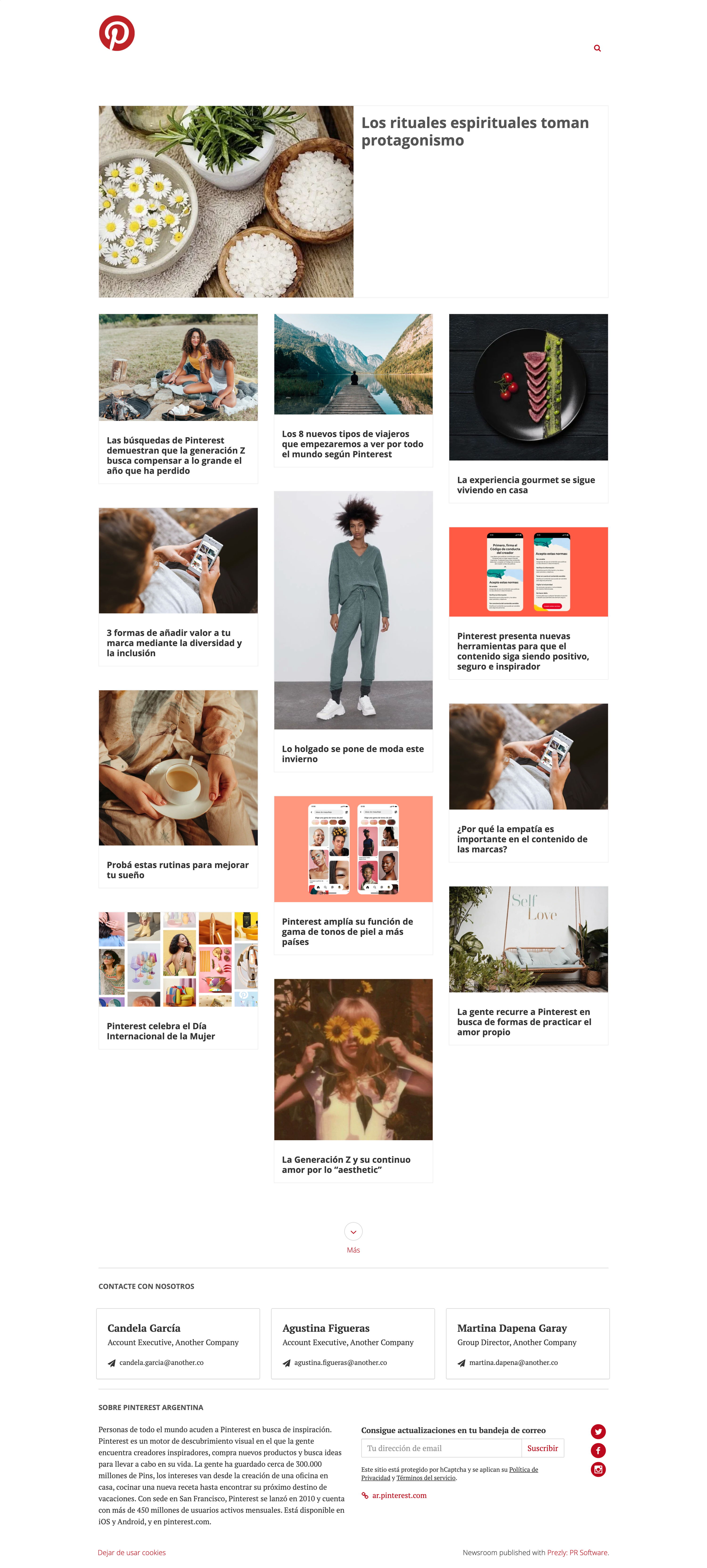
Pinterest's newsroom is exceptionally on brand, given that its platform is the go-to place for curating collections of stunning images with minimal text. It's no surprise then that its newsroom is similarly visual-first.
Again, the top navigation is kept clean, instead inviting the viewer to scroll down (I would bet that most people make it halfway down the page max before being tempted into clicking on one of those tantalizing pictures!).
Press contacts and a brief company boilerplate appear at the bottom, while their list of social media profiles is where the bulk of the links come in – unsurprizing for a social platform like Pinterest.
Like it? Share it.
